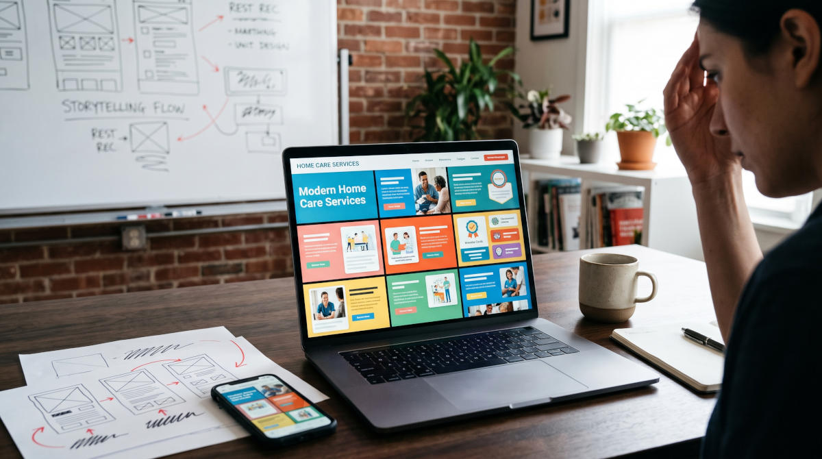
If you ever watched the opening credits of the 1970's sitcom, The Brady Bunch, you remember that iconic 3x3 grid of blue squares. Nine faces appear on screen at once, looking left, right, up, and down at one another.
It’s charming for a 1970s sitcom intro. It is a disaster for a home care agency website.
Yet, if you look at thousands of home care websites built over the last couple of years—especially those created with modern templates, new AI website builders, or generalist design shops—you will see the exact same pattern. We call it The Brady Bunch Effect.
And if your agency’s website looks sleek, modern, and "impressive" at first glance, yet fails to bring in consistent private-pay care consultations or caregiver applications, this is almost certainly why.
What Is the Brady Bunch Effect in Web Design?
Today’s web design clutter doesn’t usually look like an ugly, outdated website from 2012. In fact, modern templates and AI generators already know how to use clean fonts, nice colors, and plenty of padding.
Their mistake is using too much structure, too many competing boxes, and too many cute design tricks all at once.
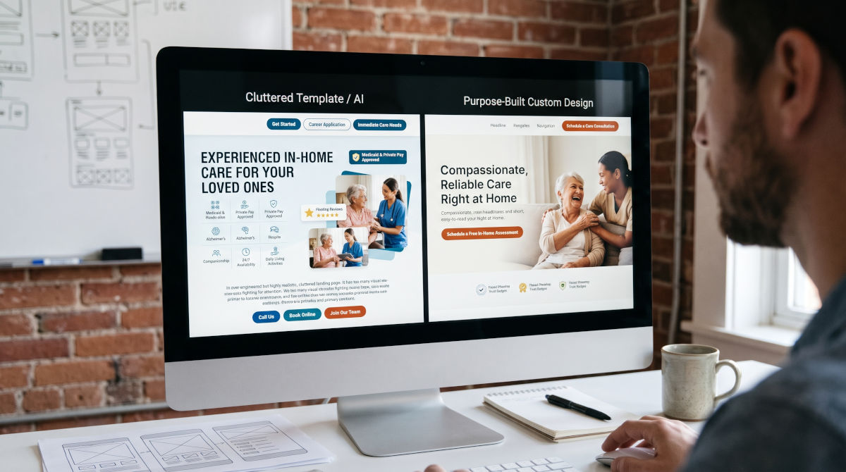
Instead of guiding a visitor smoothly down the page, these sites are built from top to bottom out of staggered boxes, offset photo collages, Bento-style feature grids, floating review badges, and split-screen callouts.
- At a 3-second glance, it looks great. When you step back and squint at the page, all those broken-up, offset windows create interesting visual texture. As an agency owner reviewing a designer’s mockup, your first reaction is usually, "Wow, this looks really professional and modern."
- The moment you try to read it, it falls apart. As soon as a real person scrolls through the site to figure out what you actually do, their brain hits a wall of visual fragmentation.
Every scroll introduces a new geometry puzzle: a left-offset text box paired with two overlapping photos, followed by a four-box icon grid, followed by staggered testimonial tiles. Every box has a border, a shadow, or a background color screaming for equal attention.
Why Templates and AI Builders Love This Trap
There is a simple reason why theme marketplaces and AI web generators rely so heavily on the Brady Bunch Effect: they are designed to sell templates, not home care.
When a software company or theme developer showcases a template, they want to show off every visual trick their code can perform. Offset cards, asymmetric grids, and floating widgets look dynamic in a portfolio screenshot. They make a generic site look "custom" without requiring any real thought about the message inside the boxes.
When an inexperienced designer or AI tool applies that same approach to a home care agency, they cram your services, your philosophy, your badges, your service areas, and your hiring links into dozens of competing windows from top to bottom.
It looks like design. In reality, it is just organized noise.
Your Website Shouldn't Make Families Solve a Puzzle
Here is the fundamental flaw with fragmented, over-designed layouts: they force the visitor’s brain to assemble your message instead of simply absorbing it.
When a website is broken up into dozens of staggered boxes and cute layout tricks, the reader has to constantly work to connect the pieces together:
- Where do my eyes go first—the box on the left or the floating badge on the right?
- Does this photo belong to the headline above it or the card next to it?
- Is this section talking to families looking for care, or caregivers looking for a job?
In user experience design, that mental effort is called cognitive friction. And in the home care industry, cognitive friction is fatal.
Think about who is actually visiting your website. It isn't someone casually browsing for sneakers on a Sunday afternoon. It is an exhausted daughter sitting in a hospital parking lot at 10:30 PM after her father just had a stroke. It is a stressed spouse realizing they can no longer safely lift their partner alone. It is a hospital discharge planner with four minutes to find a reliable local agency before Friday afternoon.
These visitors are anxious, distracted, and usually reading on a smartphone screen. They do not have the mental bandwidth to solve a jigsaw puzzle just to find out if you offer dementia care in their town and how to reach a real human being.
When a website forces them to work to piece things together, they don't push through the confusion—they hit the "Back" button and call the next agency on Google.
Why "Clean" Doesn't Mean Boring (Pacing & Purposeful Cards vs. Card Chaos)
Avoiding the Brady Bunch Effect does not mean stripping away modern design elements, avoiding cards, or turning your website into a boring, monotonous wall of text.
In fact, if every section on a page uses the exact same rigid layout over and over, visitors will glaze over and stop reading before they ever reach your phone number. Good web design relies on visual pacing—changing the rhythm from section to section to keep the eye engaged, using clean cards to spotlight key takeaways, and incorporating subtle offsets so the page feels dynamic and effortless to scan.
The difference comes down to restraint and intention:
- Purposeful Cards & Frictionless Offsets (What Works): Cards are one of the best tools in web design when they act like clean "containers" that draw the eye straight to a specific service, benefit, or next step. Paired with subtle, frictionless offsets and generous breathing room, they act like visual reset buttons—breaking up text so a busy reader can scan your core offerings in seconds without feeling overwhelmed.
- Card Chaos (The Brady Bunch Puzzle): Turning the entire website from top to bottom into a patchwork of staggered, mismatched boxes, floating badges, and overlapping grids. Instead of drawing the eye into the content, competing cards split the reader's attention in four directions at once.
Think of it like a well-designed magazine spread versus a crowded bulletin board. Both use clean boxes, photos, and layout shifts—but one effortlessly guides your eye from start to finish, while the other forces you to hunt for what matters.
Visual Chaos vs. Guided Reading Flow
A high-converting home care website doesn't try to dazzle visitors with layout gymnastics. Instead, it uses smart visual rhythm to guide a calm, reassuring conversation with a worried family.
Here is the difference between a "Brady Bunch" template and a website engineered specifically for home care leads:
| Feature | The "Brady Bunch" Template | Purpose-Built Home Care Design |
|---|---|---|
| Visual Hierarchy | Multiple offset boxes compete for attention simultaneously on every scroll. | One clear focal point per section guides the eye naturally from top to bottom. |
| Reading Experience | Feels like solving a puzzle—eyes bounce left, right, and diagonally to connect pieces. | Effortless, linear storytelling that answers one family question at a time. |
| Cards & Offsets | "Card chaos"—mismatched, staggered boxes and overlapping badges competing on every scroll. | Purposeful cards that spotlight key info, paired with subtle, frictionless offsets to prevent text fatigue. |
| Mobile Experience | Offset grids stack awkwardly, creating endless scrolling and disjointed text. | Built mobile-first with clear headings and thumb-friendly call/consult buttons. |
| Visitor Emotion | Subtle overwhelm; hard to absorb the core message quickly. | Immediate calm, clarity, and confidence that your agency can help. |
How to Tell If Your Website Has the Brady Bunch Effect
You don't need a degree in web design to test your own site. Open your homepage on both your desktop and your phone, scroll slowly from top to bottom, and ask yourself three honest questions:
- The Squint Test: If you blur your eyes slightly on any section of your site, is there one obvious place your eye lands first—or are three or four different boxes fighting for your attention at the exact same time?
- The "Everything But the Kitchen Sink" Check: Are you trying to explain every single service, award, testimonial, and hiring pitch on the homepage using mini-boxes, instead of letting dedicated service and city pages do the heavy lifting?
- The 10 PM Phone Test: Imagine you haven't slept in two days and you're worried about your mom's safety. Can you read your homepage from top to bottom in 45 seconds without your eyes jumping back and forth across staggered columns?
If your site looks impressive at a glance, but feels tiring to actually read, your layout is getting in the way of your leads.
Simplicity Converts Better Than Cleverness
In home care, trust is everything. Families hire the agency that makes them feel heard, understood, and relieved—not the agency with the flashiest grid layout.
Great web design for home care agencies isn't about seeing how many clever design boxes you can fit onto a page. It’s about using smart pacing, clear cards, and frictionless design to remove every barrier between a worried family member and the phone call that gets them help.
Want a Second Set of Eyes on Your Agency's Website?
At HomeCareWebs.com, we build calm, high-converting websites exclusively for home care agencies—designed around how real families and caregivers actually read, think, and take action.
If you suspect your current site is making visitors work too hard to connect the pieces, reach out for a free, no-pressure website clarity review. We’ll walk through your homepage and show you exactly where simplifying your layout can turn more visitors into care consultations.